Episode Transcript
Chris Hinds: Welcome to Accessibility Craft, where we explore the complex challenges and emerging trends that are shaping digital accessibility, while sipping on unique craft beverages. This show is proudly produced by Equalize Digital, The most trusted name in WordPress accessibility. Join us every week as we break down accessibility news and share the expert strategies we've used to help make millions of websites more accessible. Grab a drink, the show starts now! Chris: Hey everybody, it's Chris here at the top of the show. I'm the editor guy, so I get to do things like this. Wanted to let you know that we had some camera syncing issues
when we were recording this episode, and it was just unfixable. So this is going to be an audio only episode, and I'm here at the top just letting our watching audience know. The listening audience won't notice a difference with this. But now we are going to get onto the actual show. Amber: Hey everybody, it's Amber, and I'm here today with Chris. Chris: Hey everybody. Amber: And Steve. Steve Jones: Hello, everyone. Amber: And we are super excited to be here for episode number 184 of Accessibility Craft. We're gonna be talking about our website redesign, which I know I, for years maybe, have said needs to happen.
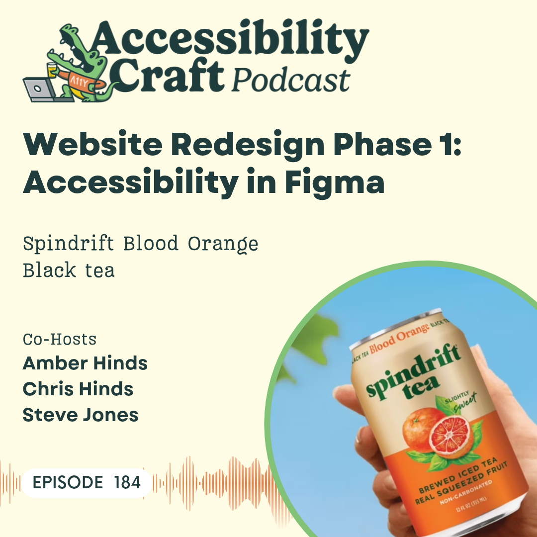
But it is happening, and we're gonna talk about phase one of a website redesign, which for us… I guess maybe technically this is phase two design, 'cause we did do a bunch of, like, content prep before that. If you wanna get show notes and a full transcript, you can do that if you go to accessibilitycraft.com/184. And do not forget, please find that like button and subscribe wherever you are listening and hit it. Leave us a review or a comment. It helps spread accessibility awareness to the world, and we appreciate it so much. What are we drinking today, Chris? Chris: We are sending off the Summer vibes with an iced tea from Spindrift.
So we're getting into Fall, so we're having Spindrift Tea, which I think is a new offering from them. I haven't seen this before, but it's a slightly sweet brewed iced tea with real squeezed fruit, and we're having the blood orange flavor. I'm looking forward to cracking one of these open and giving it a try. Amber: Yeah, I'll admit this came in the mail and I was like, "Spindrift makes pop. I didn't know that they made iced tea." I've never seen Spindrift iced tea before. Chris: Mm-hmm. Yeah, and just for the listening audience at home the ingredients are brewed black tea, apple juice, blood orange juice, lemon juice, tangerine juice, and blood
orange extract from blood oranges. That's the entire ingredient list. Amber: This is actually a nice real beverage. 14% juice and no weird herbs added. Sometimes they, like, put weird herbs in, and I'm always suspicious. Chris: Yeah, no weirdness, no botanicals. It's gonna be flat. It'll be still not sparkling. I'm excited to give it a try. Amber: In a nice can, usually I feel like iced tea comes in bottles, not cans. Chris: Mm-hmm. Steve Jones: Mm-hmm. Amber: What do you think about the smell, Steve? Steve Jones: Smells orangey. Chris: Yep. Amber: Mm-hmm. It is interesting though because there is a greater quantity of
apple juice than orange juice, but they don't call it apple orange. Chris: I'm guessing it must be apple juice for the sweetness. Amber: Oh yeah, 'cause there's no sugar. Chris: Mm-hmm. Amber: Yeah. What do you think? Chris: Light, refreshing. Also not, like, my favorite thing ever that I've tried on this podcast, but not bad either. I'm feeling kinda middle of the road on this. Like, I don't know. When I was growing up in like the '90s, my family was pretty frugal around groceries and drinks in the house. So one of the standard practices in my household growing up as a kid was we would cut orange juice with 50% water, so you do like half juice, half water.
And so that's kind of what it's taking me back to, is like the memory of drinking the watered down orange juice, as a kid. I'm not getting a lot of the tea. I was hoping for it to be like a little more tea forward with the orange a little more subtle, but I'm mostly just getting like watery orange juice. Amber: Chris, did your family get, like, bottled orange juice and add water to it? Or did you buy the frozen orange concentrate and just add too much water when you mixed it? Chris: No, we didn't do the concentrates. It was the bottled orange juice, but then you would cut it with water. Steve Jones: Yeah.
Amber: Interesting. Steve Jones: We had the frozen, like, little canister things. Amber: Yep. Steve Jones: And, like… Amber: My, that's what we had at my mom's house. My dad bought the real, 'cause he was fancy, he would buy, I don't know, one of the Florida things, and it actually had pulp in it. And I remember we'd go there and we'd be like, "Whoa, this is so different from the canned frozen concentrate that we drink at my mom's house." Chris: Yeah. Steve Jones: I remember having to use hot water to melt it because it's, like, frozen, right? Chris: Mm-hmm. Steve Jones: And then you gotta put it in the refrigerator and let it cool down.
Yeah. I'm not a b- Like, so cold tea, I really … So I like hot tea, but I don't like cold tea. Amber: Really? You don't drink iced tea? Steve Jones: No, not at all. Amber: Oh. Steve Jones: And made me think I wasn't gonna like this at all. Like, but like Chris said it's not very … It doesn't taste a ton like tea, then again, it's not the most pleasant flavor. I don't know. I don't know what it is. Amber: I get the tea. I feel like you have to kind of let it sit in your mouth for a minute. 'Cause you do get the juice first, I feel like. But kind of on the tail end, I get a little bit of a black tea.
But it's, it is a very weak tea flavor. I also noticed I didn't see anything about caffeine. Like, sometimes on these beverages they say if they have, like, a percent caffeine, and I don't see anything, so maybe that sticks with the it's more water than tea, or more juice than tea. Steve Jones: Yeah. It's very watery. Watery is the word that comes to mind. Extremely watery. Like, no, no bubbles, you know, because it's not carbonated. Amber: Yeah, I feel like there's a brain thing for me where it feels weird to drink a non-carbonated beverage out of a can. I expect beverages that are in cans to be carbonated, and so it feels wrong somehow.
I don't know. Steve Jones: Yeah. Amber: It was like when we drank the water . Didn't… Steve Jones: Yeah, just straight up water. Amber: Like Liquid Death, that's their whole thing, canned water that looks really badass. Can I say badass on the internet? I don't know if I can. Steve Jones: We're gonna get an explicit tag on this episode. But we actually did water, we actually did water once, just actual water. Amber: Yeah. Yeah. Steve Jones: So… Amber: I don't know. Steve Jones: Cool Amber: Would you buy it again? Steve Jones: I don't think so. I'm gonna go thumbs down. Amber: Chris? Would you get it again?
Chris (2): Yeah, I've, for myself personally, I'm probably a thumbs down on, on this one. I I, I appreciate the concept and, like, what they're doing with the ingredients but I think the f- the flavor just doesn't quite what I was hoping for. Amber: Yep. Well, you can't win them all. Steve Jones: Yeah. Chris (2): No. Amber: It's definitely not the worst one we've had, so I'm gonna keep drinking it. Maybe it'll eventually… Sometimes by the end of an episode, I'm like, "Okay." Steve Jones: Yep. Yeah, nothing… Amber: …grown on me… Steve Jones: Nothing will top the pickle beer. Amber: I still find it funny that we took the extras to a party thinking
it would be a joke, and somebody was so excited and they're like, "Oh, I love this," and they drank it. And I was like, "Who are you?" Chris (2): "Good for you…" Amber: And… Chris (2): "I'm glad this makes you happy." Amber: So to all of our listeners, just because we say thumbs down on something, you might like it. Maybe you should give it a try. Yeah. Yeah. Well, we should shout out some exciting things that are happening at WordPress Accessibility Day. We're not gonna go super deep. Definitely go check it out. If you have not registered yet, you can still register if you go to wpaccessibility.day/2026.
But you can also see some of our team members during WordPress Accessibility Day, like Steve. Steve Jones: That's right. Yeah. So I will be talking at WP Accessibility Day, talking about when does page zoom become an accessibility failure? 'Cause there's a lot of nuance around page zoom, so I thought that would be a good kind of specific topic to address. So I'm excited to go there and answer any questions that people have. And also another one of our team members is giving a talk. William, our lead plugin developer. I don't remember the exact title, but something about accessibility testing in s- in CI.
So very technical talk and very interesting. So I think you should all check those… check all the talks out, but especially me and William. Chris (2): Yes, for sure. And they're at very different times, so that's the other thing to know about this. If this is the first time you've heard WP Accessibility Day mentioned it's starting on October 7th, 2026, and it is a full 24 hours, wall to wall, every hour another speaker. Whether you're awake at 3:00 AM on the 8th or, you know, 11:00 PM on the 7th, or any time in between, you're, you're gonna have stuff to, to watch, and you can catch the recordings later, too.
But super exciting. I'm doing an emcee again this year for the second year running, so I will be, I'll actually be emceeing for Steve's talk as well as three others kinda closing out strong from the 11:00 UTC until 14:00 UTC time slot. You'll see me in the chat and handling Q&A and transitions and intros and all that good stuff. what about you, Amber? Amber: So I'm giving opening remarks, so you can hear opening remarks if you tune in from me. Otherwise, I am doing a million things behind the scenes. And it is also worth shouting out that Paola, our content specialist, is also going to be helping behind the scenes.
She's gonna be one of the technical admins in that last stretch, so she'll be on with Steve and Chris. You won't get to see her, but she will be there making sure that the stream actually runs. So it is like Equalize Digital year at WordPress Accessibility Day, apparently. Chris (2): Mm-hmm. Amber: And I will admit that one of my favorite things about WordPress Accessibility Day is when it ends. I love it, but we spend a whole year basically from February through October planning, and then this last, like, two weeks right before the event, we're doing tons of extra marketing and making sure all of the Zoom stuff is set up properly
and training all of our volunteers. And as we're recording this, I've been on lots of calls doing lots of late nights. I'm very excited for the conference happening in two days, but we always, organizers take a little break afterwards, and I'm also kind of excited for that too. Steve Jones: I think it's worth noting too that Equalize Digital is a proud sponsor of WP Accessibility Day this year as well. Amber: Yeah, we're a platinum sponsor this year. It's been difficult in the community. A lot of events have had difficulty getting sponsors, and originally we were gonna be a gold, which is what we were last year, but just seeing the difficulty
that WordPress Accessibility Day has had and because we as a company feel like it's so important to have this education out there, we actually increased our sponsorship to try and help cover the cost for the captioning and the ASL because those were not being covered. That is a thing that we did, we think is really important. If you haven't registered yet, you could choose to donate and get a T-shirt or donate and have a micro-sponsorship to help support the conference. So I would recommend if you have that financial flexibility to do it because it is really important and we need that support in order to keep it going.
Chris (2): So that's WP Accessibility Day. Make sure you register, donate if you can, like Amber was saying. The t-shirt is really cool. I've gotten to see it in person now and I'm excited to get mine as an emcee. But I think what we're really here to talk about today that, that you alluded to before, Amber, is we are in the process of redesigning our website. And we are at the tail end of the design phase of that, it's a great time to reflect on everything in that process and recap for people what we did, what we considered, and ask you a bunch of questions. But before we get to all of that, let's take a quick commercial break.
Steve Jones: This episode of Accessibility Craft is sponsored by Equalize Digital Accessibility Checker, the WordPress plugin that helps you find accessibility problems before you hit publish. Thousands of businesses, nonprofits, universities, and government agencies around the world trust Accessibility Checker to help their teams find, fix, and prevent accessibility problems on an ongoing basis. New to accessibility? Equalize Digital Accessibility Checker is here to teach you every step of the way, whether you're a content creator or a developer, our detailed documentation guides you through fixing accessibility issues.
Never lose track of accessibility again with real time scans each time you save, powerful reports inside the WordPress dashboard, and a front end view to help you track down hard to find issues. Scan unlimited posts and pages with Accessibility Checker Free. Upgrade to Accessibility Checker Pro to scan your website in bulk, whether it has 10 pages or 10,000. Download Accessibility Checker today at EqualizeDigital.com/Accessibility-Checker. Use coupon code AccessibilityCraft to save 10% on any plan. Chris (2): All right. And we are back. So arguably of the more challenging things, I think, w- as part of
this entire process was finding the design shop that we ultimately decided to work with on this one. And I'm wondering if we should go into what that process was like and, and like how we went about choosing the design shop and what our criteria were. Amber: Yeah. I think it's worth mentioning we used to have a designer that we worked with for all of our client websites, but we don't build a lot of client websites anymore. So we did go to him and ask him to give us a quote, but he doesn't do a lot of software or SaaS design, and we… That was one of our goals, or is one of our goals with this redesign, is to have a m- more software-forward
website than a service-forward website. Of course, we still have the services, very important, but we need them to kind of match each other and not have the software be secondary or kind of added on, which is how it feels on our current website, at least to me. So we went and found some other people, and I did some initial just, like, vetting and looking all over, and then Steve and I met with a bunch of them, and I don't know if you want to talk about what you were looking for, Steve, when we were talking to them. But we, we met with a couple individuals, a couple people who represented companies, and I can circle back on who we actually chose as far as,
like, what kind of agency they were. We met with people in the US, outside of the US. Steve Jones: Yeah, I mean, I think, you know, with these things you're always kind of balancing several different criteria, right? And I mean, first and foremost, we, you know, in the AI age, everybody's like, "You could just have Claude do this," and like, "You could just have whatever Claude design do the design for you." I think we were all very aware that, you know, for our level of of company that we are at now and the, the, what we wanna put forward in the website, that really wasn't an option, and that we wanted to find somebody that
could really help us build a unique and custom design system and w- from which we could build our whole website out of, and we wanted it to be… It's somewhat of a traditional design process, but also very kind of, developer-forward. Everything's componentized, everything has this, a guide that it follows. And I think to do that you need to kind of go with a more of your traditional design shop. And just the amount of massaging of these designs we've done along the way has kind of shown that, you know, design is not something you throw into a, a chat bot and it spits something out. It's something you massage with other humans over time to
get it to where you wanna go. So that's why we kind of went with kind of, we're gonna hire somebody, we're gonna do this the right way. 'Cause, you know, our website current, our current website is, what, six, seven years old? Like, these websites last, so it's worth putting the investment in. And then I think the other things you're balancing too is budget, right? And so I think that was kind of a big thing for us was, you know, how can we get the most creative and and enterprise-feeling website, you know, for a good value as well, right? Amber: Mm-hmm. Yeah, and when I was first identifying people, that was kind of why we found
some people that folks recommended that are here in the US, but we also intentionally said, "Okay, we should probably, because of our budget," and we are a small company, right? Like, we don't have $50,000 to put into just the design of this website. And we knew that we needed somebody to help with a lot of different post types. It's not just a homepage and three interiors. I think our scope ended up being, like, 20-some designs. And, and so I did two things. One was I went on Upwork, which I know people don't like it, but I was like, "I'm gonna just see." And I found someone there that clearly represented an agency that had a portfolio
that had a lot of, like, SaaS-type things. And then I also went on Behance, so I guess designers, if you're listening. And I, like, just surfed designs that were related to, like, SaaS or software, and that was how I found the company that we ultimately ended up deciding to work with, who's done a ton of, like, fintech design, and they happen to be in Ukraine, not in the US. But so it was kind of like we asked for recommendations, but we also just looked at portfolios. Chris (2): Yeah. I feel like the looking at the portfolio part was one of the more intensive parts of the process because we wanted to see stuff that made us
feel excited about, ooh, what could they create for us if they made this? At least for me, that was like where I really paid a lot of attention. And of course, as the numbers guy, I was watching, I was watching the numbers pretty carefully because we entered 2026 with an idea of what we thought we wanted to spend on this. And getting multiple quotes from multiple people, it, it became apparent that we had under-budgeted by a fair bit, and so we did increase our budget ultimately for what we're putting into this. But like Steve said, we tried to find the best balance of economic value with really high quality output and a proven track record.
So… Amber: Can we be radically transparent for a second and say what our budget was? 'Cause I think it might be helpful for people. Chris (2): Around like 9 or $10,000, right? Is what we kinda…. Amber: That's what we we were gonna spend. Chris (2): And I think we've, by the end of this process, we, we will have come close to one and a half or two X-ing that, I think. Steve Jones: Mm-hmm. Amber: I think it's gonna be over $20,000. Just for Figma files, folks. Chris (2): Yeah. But, this is what real intentional quality work costs. And it's… I don't know. I, I feel like we would be really hypocritical if we didn't value the
work of others as much as we value our own work because, you know, someone coming to, to us and saying, you know, "I want my entire site to be accessible, and I want it to cost $1,000," we might have to stifle laughter, right? Because this, this work is super intense, and if you're doing it the right way, it is time-intensive, labor-intensive. And I would expect the same of someone producing a high quality work product for me on the design front-side or the code-side or whatever, right? And so we, we had to come up in budget to get the outcome we wanted. Amber: Mm-hmm. Chris (2): Yeah. So I, I think my next question for the two of you, because I, I think, and maybe
I can just be the interviewer for most of this, honestly, because you two have been closer to this process than me. What, what kind of information were we giving upfront about acce- accessibility expectations? And if we could do a split, right, of the, like, pre-sale and post-sale, I think that might be interesting. Like when we were vetting people, what did… Amber: yeah. Chris (2): Versus when we're actually rubber hits the road and working on stuff? Amber: Sure. So I mean, I could say, first of all, I did not assess the accessibility of anything in anyone's portfolio as a deciding factor. Because I decided that because we're not actually having them build the website,
which a lot of the designers we talked to, they weren't only a design shop. Like, they have dev, and they could build. And we were very clear, our only deliverable we want from you is Figma because, frankly, I don't think anyone would want us as a dev customer. We are so opinionated, they would not like it. But also, we have those skills in-house, so it didn't make sense for us to do that. So we did… So I did not care at all whether or not the websites that they had in their portfolio were accessible. What I cared about is, did they look interesting and cool? Did they, you know, communicate nicely in a very polished enterprise
manner the products and the services that they were designing? I did, before we even started interviewing, we had our content phase, which I guess I mentioned earlier was maybe technically phase one. Steve Jones: Yeah. Amber: Which is I put together a doc, and I use Google Docs now in this pageless format, which I love, but I wish I actually knew how many pages this was. I guess it, it's, it says it's, like, maybe e- 18 pages just in… It has multiple tabs. It has a general design guidance tab, a site map tab where, like, Steve and I have been working out what are the custom post types and the taxonomies
and, like, the data architecture, which I told the designers they can ignore that. It's got a page just for the header and footer. Then it has a page w- for the content that has all of the content because I was like, the only way they're gonna design and the only way we're gonna get an accurate quote on design is if we can hand them all of this and be like, "This is what we want on each design and every section and all the words," and all that stuff. And that one, actually, I just looked at it. I can see Google Docs says that's 103 pages. And then it also has a competitor links tab that just, like, links to competitors
on both the product and the service side. So I think I gave them like 150 pages of a Google Doc to scope on, and they were all like, "Oh my gosh, this is so amazing." We originally started planning and site mapping in 2023 or, or 2024, and we had talked about a bunch of pages and things like that. But this content I completely rewrote in, like, February of this year, and it, it took me a lot of hours just to, like, get the content. And this isn't all the content for our website. This is the content for the pages I want to design. Steve Jones: Right, but… Amber: Yeah. Steve Jones: To Chris's question, like, were kind of describing some accessibility
features inside that content, right? Amber: Yeah, so in the, so that general design guidance does have some accessibility stuff, and what I have on that tab is, our logos and our colors, but I used our contrast grid tool that you can get off our website. So I put all of our colors into that, and I gave them that. And, and our brand colors are way more n- now than the yellow and blue that's on our website, because we have a lot from different products and things. I told them I preferred AAA, but Steve made a comment on the doc. He's like, "There might be places where we should have AA, because we don't wanna stifle creativity."
And I was like, "Yeah, I think you're right." So, we specified what fonts, because we put a lot of effort into choosing the right typography, and we were basically like, "This is a heading font. This is a body font. You don't need to explore that. This is what you're gonna use." Let's see. I have we want sentence case for headings, no all caps for anything, minimum 16 pixel base font, 18 pixel might be better. Avoid long line lengths, so I said under 100 characters with spaces, less than 75 without spaces, not to justify body text. That was all of the text thing. I have a whole section in the buttons where we talked about how you need
to make sure that there's s- some visual distinction other than color on buttons between the different states, so when they're hovered or focused, it can't only be a color change. There needs to be a shape change, or if there's an icon or something else that denotes that. And I think Steve actually mocked up a couple of different examples, or had Claude do it, I don't know. Steve Jones: Mm-hmm. Yep. Amber: Them like, here's different, right? Or it could have a shadow or just something so that it's not only changing colors, and we told them that up front. I also had a thing where I was like, you have to know the different…
You have to clearly distinguish buttons and links. Links that are styled as buttons should not have the exact same design as an HTML button, like for example, to submit a form or to change a carousel or something like that. So that was provided to them. The other accessibility best practices that I have listed in here is all fields have to have visible labels and clear required indicators, and we want the required indicators to be the word required and not like an asterisk. All field boundaries and other key UI components must have at least three to one contrast with the background. Color alone is not used to convey information, add words or icons.
No text has been designed in any way that can't be styled with CSS or that would require spans for every letter. So, for example, rainbow text, where every letter is a different color, because sometimes when you insert spans like that into words, it makes screen readers not be able to read them properly. Always underline links outside of navigations and headings or in card style sections, add an icon instead of an underline. That's fine. And then I also told them tap target size ideally forty-four by forty-four pixels, but no smaller than twenty-four by twenty-four pixels. So that was all in the brief that we gave people when they were
scoping, and they knew upfront that this was gonna be the expectation before they even bid the project. Because I'm like, I want them to know we're gonna be looking for this stuff, because if that's not part of their normal process and it's gonna take them longer to check for those things before they hand it to me, I want to know that in the quote. I don't, I don't want to be surprised later on when they're like, "Hey, this is gonna take more time." Chris (3): So what I mean, you just gave a whole list of the upfront requirements for, that we handed off for accessibility. What were we actually practically speaking looking for once the designer
was handing us stuff to review? Amber: Mostly those things. I think a thing that came up beyond the things in those lists, like the color contrast and all of that, was realized positioning, and I feel like Steve, we even, you even talked about that when I asked you for feedback on a section earlier today, 'cause we're, like, just finishing one of the last pages, about, like, what they choose to emphasize and not emphasize. Steve Jones: Yeah. Amber: Which can be accessibility related or, like, how they're connecting headings or doing things like that, and I don't know if you wanna speak a little bit to that as something you've been noticing and watching for.
Steve Jones: Yeah. I mean, I don't know if it's necessarily an accessibility thing but like, you know, you can… You know, a lot of times the designer looks at things a little different than like we may look at it from a business positioning standpoint, right? So, I'm going through and evaluating, like, when Amber's like, "Hey, what do you think about this?" Now and of course I do have a design background, and I did go to college for design, so of start to lean on that. And, you know, I'm looking for the basic things like balance and things like that. And like sometimes though Amber's done such a great job of providing
all the content, it's just kind of slotted in and like, you know, like in this instance it was like the most important piece was very small, and it's like, you know, that should really be brought bigger because that actually is what gives us the most authority. So but that's kind of a content thing, but it has to be translated through the design layer, right? So that's kind of the stuff I'm looking for. Now what actually led me to that was an imbalance in design, right? One side… It was like two columns, and one side was very colorful and had even content, and the other side was like a testimonial that
was just kind of bland text with like a little credit at the bottom. Well, that credit brought a lot of authority. And then it was like, so it's like a very large major hosting company that we've done an audit for It's like, that should be like really highlighted. Now I don't think it's acc- accessibility problem, but I think that we're trying to balance all these things like between making it look good, making it be authoritative making us look very enterprise and professional and accessible as well. I mean, I think on the accessibility side, when designs first started to come to back some of the things that I remember us working on a lot were
even though Amber f- provided very good detail on like what buttons should look like and how they, you know, their hover state sh- should interact, not just be a color change of the button, but we also want to make a shape change too so that we have two ways to differentiate the change of that button. Because we're, you know, we're an accessibility company. Our website is a little bit of a, a proof of what we can do or, and our knowledge of accessibility. So I do remember a lot of work on those buttons, making sure that we, one, had something that we thought was aesthetically correct, that it was being implemented correctly.
And what I think is interesting you know, from direction to implementation is when Amber gets it back, and then Amber starts to educate the designer on the proper way to design from an accessibility standpoint. So I… There was a lot of that early on, but I think after a while they catch on. So we're kind of training them in a sense. Amber: Yeah I think on that note, even with the list I gave them, first two rounds of design, and then I said something to them and they're like, "Okay, we'll have a senior take a QA pass on this," there were text contrast failures all of those designs, field input borders failed contrast for, like,
the email opt-ins when they put them on. I, to this I still think they totally do not understand what I'm saying about the difference between a button and a link. Because I asked them, and to this day I'm just like, I've given up. Like, they're making a style guide, right, that, for devs that, like, show components and, like, this is the headings and this is all the stuff, and they have sections where they have, like, they call- it's labeled buttons and then it's, like, links that are styled like buttons, right? And they have… and I'm like, I still don't think they understood what I kept trying to tell them, and I'm like, whatever.
I'm just in my dev notes gonna be like, "Ignore what they put there. This is a link. This is a button." Steve Jones: Well, actually, I mean, there's a third rail… Amber: Yeah. Steve Jones: Too. It's, there's link buttons, links, and submits, which are actual buttons, right? Amber: We also, a thing that came up a bunch that I hadn't planned, but in the first couple rounds of design, they put a lot of things into carousels. Steve Jones: Mm-hmm. Amber: We ended up being like, "No." Like, there are going to be a couple of carousels, but a lot of places we're like, "No, a carousel does not make sense here." And that was one, Chris, that you chimed in on because they had
an option for testimonials when there's multiple testimonials in a carousel. And I don't know if you wanna speak about that a little. Chris (3): We might have even talked about this on a previous episode as an example of some other thing we were talking through, but basically they had… We wanted to present multiple testimonials in an area as, like, a social proof thing. And so as part of the design system, I think one of the components that they put together was a testimonial. It'll probably end up, what Steve, being like a testimonial block or something like that, that we put together or something, or maybe a pattern.
But they had done it as a… They had two options, right? One was as, like, a, a two-by-two kind of offset grid where, you know, some elements were smaller than other elements, so it wasn't a perfect grid. And then the other was a more traditional slider where you could see, like, one and a half testimonials. And so I'm looking at it, and I see, on the one side I see four testimonials without having to do anything, and on the other side I see one and a half testimonials and I have to do an input or an action to be able to get to more information. And I remembered back, I think, to some heat mapping work we did
on our own current homepage, and we have a, a carousel or a slider there that presents testimonials. And I think in our heat mapping we had learned that pretty much nobody clicks on it ever. And so there's multiple testimonials that literally none of you have ever watched or seen, at least statistically, the people listening or watching this and all of our customers who have ultimately hired us. Amber: Those ones I should highlight are video testimonials that we paid a video company to, like… Chris (3): Yeah, those were expensive. Amber: And edit into videos, and nobody's watched them. Chris (3): Yeah.
Nobody watches them. And so that was my whole point is let's just show the information, right? Let's be simple. But-- And this leads me to a thought that I wanted to convey, 'cause I was literally saying this to a freelancer that I was on a call with yesterday or the day before when I happened to mention off the cuff that we're redesigning our website. Because that person had been one of the ones that repeats the myth that, oh, accessible means boring or bland or, you know, not interesting to look at, right? And too constrained, you know, limits creativity, blah, blah, blah, blah, blah. We've heard that a million times before in a million different ways.
But what I told them is we're actually doing this right now, and I think what has come out of this incredibly lengthy, exhaustive and expensive process is nothing close to boring or bland. Like, it looks super clean, professional, visually interesting, true to the trajectory that we're going on, right? Steve Jones: Mm-hmm. Chris (3): That's something that I hope once we get to the next stages of this, and this eventually is out in the wild and visible to the public, is people are gonna look at that and be like, "Wow, that's what accessibility is? I didn't know this was possible." Right? " I thought it had to be black and white and, you know, nothing going on with it."
So to that end, what is the next step in this process? Amber: Well, I… Their designs are getting finished. I gotta write some dev notes, and then, Steve. Steve Jones: Then Steve's team's gotta get on it. Amber: What kind of accessibility information do you think you're gonna include in dev notes for our developers about these? And how much do you think you're gonna let them just start, or are you gonna start and then have them loop in? Have you thought about that? Steve Jones: You know, I have, I literally just, like, t- couple days ago this started to kind of feel like, you know, got this slotted
in for October and November, right? We had it slotted in for July and August, but we wanna get the designs right, so we're taking our time. But no, I mean, w- you know, so our team is a- at a little bit of, at a, kind of a huge advantage already because we are an accessibility company. We do audits, remediations. Our developers know that you gotta make things accessible, and that we're gonna take the extra steps to make things accessible. I think that already done a lot of work in the, you know, when we always talk about shifting left, making sure that it's designed accessible. We don't have to make all the accessibility decisions at the time
of dev, the buttons, we have a comp- we have a whole component system o- outlined here that we can… We have all the different states of the buttons already defined, so and that's kinda self-documenting designs we're just gonna build straight off of that. But I think there's always gonna be a lot to think about when it comes to accessibility. In a previous episode we talked about performance. You know, does performance make a website more accessible, or is an acce- accessible website more performant, right? And that's a huge part of this for me from a technical standpoint, is that we have these creative designs and, I mean, a little bit of a, you know, a verbal
explanation is this is a very layered design where we're trying to layer in our current branding a creative design layer, and with a, an operational layer, like buttons, text, that all kinda work together in concert in a good way. And the creative layer of that utilizes a lot of gradients and what, which you would look at and go I'm gonna have to make a lot of im- background images," right? But for performance, I'm already looking at, like, how can we build how can we build up blocks or classes that help facilitate these, all these, like, gradiated s- backgrounds that we can build programmatically so they
load fast and don't require images. And so that's a lot of what I'm thinking about I'm really at, like, the component level right now. Like, and we haven't built a lot of, like, huge websites in a while, and this is our first rebuild in several years, so, I'm putting a lot of emphasis on doing this right. We now have AI that can help way… Like, the website we built before, no AI. It wasn't even around. So now we have these MCP servers. We have, you know, we have different connectors that WordPress uses now. How can we build this in a very modular way we c- componentize the library then if we get that all right, then we could actually just build the
pages out real quick with blocks. Chris (3): Mm-hmm. Steve Jones: So a lot about those things, a lot about performance and accessibility and just a whole lot to think about 'cause this is a showcase. This website has a purpose to showcase who we are, but it also showcases, you know, what we do as well. And if it's accessible and performant, conveys those messages, I think it'll be a great success and a great improvement over what we currently have. Amber: Yeah. So I think that what we should do is we should plan, I don't know, in a couple months let's call it, to have a part two on this conversation, and we can
talk about some of the accessibility decisions that you made in the dev and the approach to that based on what you said now that you've teased. Like, where did it actually end up? 'Cause I know already there's been some conversations about should it be full-site editing, should it use a bunch of meta fields, like. Chris (3): Steve and Amber will be pale and emaciated with bags under their eyes. They'll look like Gollum from Lord of the Rings. Steve Jones: Yeah. Amber: But … Chris (3): It'll be a lot of work Amber: But it'll be a fun follow-up, so everybody can stay tuned for that, I think. And maybe at some point when we get kinda close, we might give a teaser of what
an image of like the homepage or the Accessibility Checker page looks like. Right now we're keeping that under our belt, so I'm sorry if you listened to this or tuned in on YouTube thinking you were gonna get to see the design. But… Chris (3): Not yet. Amber: I'm really excited about it. I think it's… It looks so pretty. It's got lots of colors, and I love the idea of it not just being a showcase for us, but a showcase for how beautiful an accessible website can be. And who knows? Maybe we can get it in the WordPress.org showcase when it's done. Steve Jones: We go. All right. Chris (3): Am, I allowed to say it'll be the only accessible website
in the WordPress.org showcase? Probably, based on our… Amber: I think that would be true. He (Joe Dolson) did a podcast for a while with Nathan Wrigley, which is so fascinating, but they would look at websites in that showcase and talk about what was wrong with them from an accessibility perspective. I think you can find it on wpbuilds.com, and I highly recommend it. It was very interesting, so yeah. Chris (3): All right. Well, thank you both for being here. Happy coding, Steve, on the new designs that are almost finalized. Steve Jones: Yeah. Chris (3): We will see you all on a, for another conversation
episode here in a couple weeks after W- WP Accessibility Day. Make sure you go register for that. That's my closing call to action. Amber: Awesome, bye everybody. Thanks for listening to Accessibility Craft. If you found this episode valuable, please help us reach more people by subscribing, reviewing, or liking the show, and sharing this with your colleagues. Accessibility Craft is a production of Equalize Digital Inc. Steve Jones composed our theme music. To learn how Equalize Digital can support you on your accessibility journey, visit us at EqualizeDigital.com.